

Overview: How Does Medical Clinic Color Palette Impact Patient Experience?
- Color psychology directly impacts patient stress levels: Your clinic’s color choices trigger neurological changes within seconds of patient arrival. Unfortunately, most Australian practices default to sterile colors that actually heighten patient anxiety.
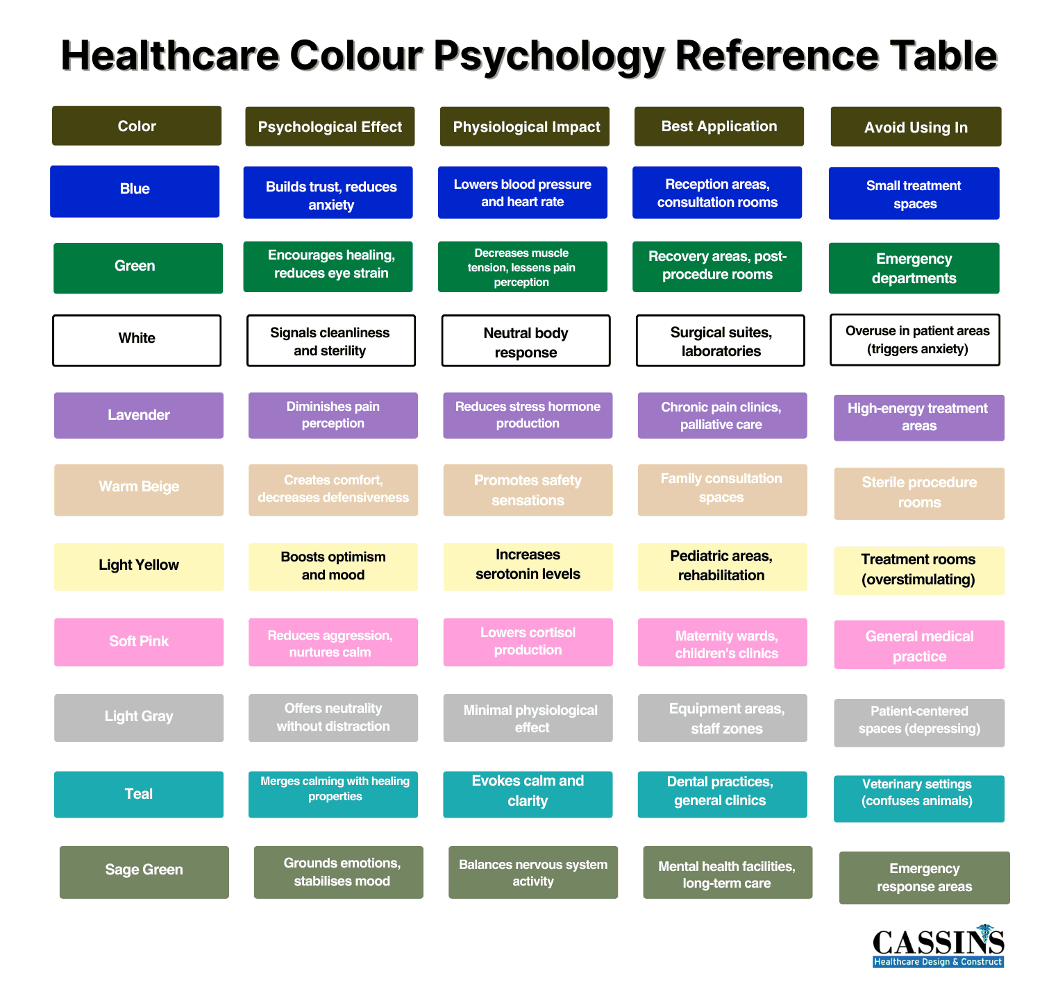
- Blue is the top medical color choice: It triggers the parasympathetic nervous system, which naturally lowers cortisol levels and heart rate.
- Green promotes healing and safety: This color activates neural pathways associated with nature and safety. Sage and forest greens work better than bright lime variations in therapeutic spaces.
- Different clinic types need specific colors: Dental clinics should use soft color combinations and avoid reds. Meanwhile, veterinary clinics need colors that calm both humans and animals
- Budget-conscious implementation: Start with accent walls or artworks before major renovations. Then, track success through patient satisfaction surveys and staff feedback.

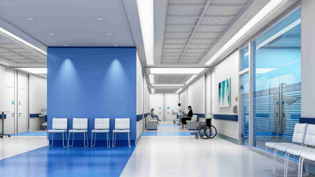
Have you ever walked into a room and immediately felt either welcomed or uncomfortable without knowing why? That fleeting feeling of unease in a plain white hospital room or the immediate relaxation you feel in a spa-like environment is based on science. Similarly, your medical clinic color palette triggers measurable changes in stress within seconds of patient arrival.
What Colors Represent Health and Wellness
Clinical colors work differently than standard interior design palettes. Think about it: your patients arrive in your clinic anxious or in pain. Because of this, they are more sensitive to environmental stimuli, including color.
Blue triggers the parasympathetic nervous system, naturally lowering cortisol levels and heart rate. This explains why many healthcare logos use blue, because it’s calming. However, too much blue feels cold and impersonal in smaller spaces.
On the other hand, green activates neural pathways we associate with nature and safety. Notably, sage and forest greens work better than bright lime variations for therapeutic spaces.
White traditionally dominates medical spaces because it signals cleanliness, but pure white can trigger anxiety in health-fearful patients.
Purple manages pain perception and provides spiritual comfort, which is particularly useful in recovery areas.
Earth tones like warm beige and soft brown create grounding effects during stressful medical encounters. These colors help patients feel more secure about their treatment.
Clinic-Specific Color Suggestions
Your medical clinic color palette needs to match your practice type.
Best Color Combination for Dental Clinic
Your dental medical clinic color palette is so important for patient comfort, especially considering dental anxiety affects 16% of adult Australians. Soft blue-green combinations work exceptionally well in dental settings, especially to promote relaxation during procedures.
When it comes to the best color combination for dental clinic, avoid bright reds or oranges in treatment rooms as they subconsciously remind patients of blood. For paediatric areas, incorporate gentle yellows with light greens to stimulate happiness without overstimulating young nervous systems.

Best Colors for Veterinary Clinics
Animals perceive colors differently from humans, making veterinary color selection quite challenging. For the best colors for veterinary clinics, take into account that dogs see blues and yellows most clearly, whilst cats respond well to blue-green spectrums. Your medical clinic color palette should calm both species simultaneously. Notably, muted blues work well because they relax humans whilst remaining visible to most animals. Separate color zones help manage different energy levels throughout your practice.

Best Colors for Medical Clinics
GP clinics serve the broadest patient demographic, requiring versatile color strategies. Older patients prefer traditional blues, whilst younger patients respond well to contemporary palette combinations. Neutral base colors with accent options provide flexibility whilst maintaining professional credibility across all age groups.
Room-by-Room Color Implementation Guide
Did you know that colors that work in your reception area can backfire in consultation rooms? Patients experience different emotional states as they progress from arrival through treatment, and your color choices need to support each phase. Planning will help your medical clinic color palette make patients feel better.
Reception and Waiting Areas
Your reception sets expectations for the entire patient experience. Warm, welcoming colors like soft peach or light yellow create positive initial feelings. These colors trigger the brain’s reward centres. Balance warm tones with cooler accents to maintain professional credibility.
Consider your lighting carefully. Natural light improves most colors, but fluorescent lighting can make certain shades appear harsh. Test your chosen medical clinic color palette under actual lighting conditions before committing to permanent changes.
Consultation Rooms
The colors in consultation rooms directly affect patient honesty and communication quality. Soft colors promote openness in conversation, psychologically signalling safety. This encourages patients to discuss difficult symptoms or sensitive lifestyle factors.
Avoid stark white consultation rooms entirely. Whilst they appear clean, they feel intimidating. Use warm white or cream as your base with gentle color accents instead.
Treatment and Procedure Rooms
Treatment rooms require the most careful color consideration in your medical clinic color palette. Keep color intensity moderate. Although you want calming effects, overly bold colors can feel overwhelming in small spaces where patients feel vulnerable during procedures.
Must-Know Color Palette Tips
Choosing the right colors is just the beginning. The real challenge is in implementing your medical clinic color palette consistently while accommodating different touchpoints.
Factor in Your Clinic’s Color Identity
Your medical clinic color palette should be consistent with your practice’s personality and brand while maintaining therapeutic benefits. Australian clinics are now moving toward a more welcoming atmosphere. Considering this, start with a primary color representing your core values. Build your entire palette around this foundation, maintaining consistency across all patient touchpoints from your website to your physical spaces.
Think About Accessibility and Inclusive Color Design
Accessibility requirements demand high contrast between text and backgrounds. Your medical clinic color palette must accommodate patients with visual impairments or age-related vision changes.
Additionally, choose colors that work under various lighting conditions throughout the day. Many clinics operate from early morning to late evening, requiring colors that remain appropriate across different natural and artificial lighting scenarios.

Practical Implementation and Measurement
Theory means nothing without smart execution and measurable results.
Budget-Conscious Color Updates
Art and accent walls can introduce therapeutic colors affordably without major renovations. Start with easily changeable elements before committing to permanent color changes.
- Test colors in small areas first. Observe patient and staff reactions over several weeks.
- Consider seasonal adjustments to maintain visual interest.
- Partner with healthcare-specialised designers who understand infection control requirements.
- Document color choices’ impact through patient feedback and operational metrics.
Measuring Color Impact on Your Practice
Track success through patient satisfaction surveys. Staff feedback also provides valuable insights into daily functionality impacts. You may monitor practical metrics that correlate with successful color implementation, such as improved patient satisfaction scores.
Frequently Asked Questions
What are the best colors for a clinic?
Blue and green are the top choices. Blue reduces anxiety and builds trust, and green promotes healing. Pair these with neutral tones like warm white or beige for balance.
What color represents medical and communicates health most clearly?
Blue is the strongest medical color, used in 85% of healthcare logos. It neurologically triggers calm responses. Green follows closely, representing healing.
What is the best color for a medical brand that builds trust?
Deep blue builds the strongest trust associations. Navy blue conveys authority, and lighter blues feel approachable.
How do consultation room colors affect doctor-patient communication?
Soft greens can indirectly encourage honest communication by creating psychological safety. Warm neutrals promote comfort. Meanwhile, harsh colors like bright white or bold reds increase defensiveness.
What colors should veterinary clinics avoid and why?
Avoid bright reds, oranges, or sudden color changes that startle animals. It’s also worth noting that neon colors overstimulate pets. Very dark colors can make some animals feel trapped.
How can dental clinics use color to reduce patient anxiety?
Use soft colors and avoid reds in treatment rooms.
.
Your patients deserve more than sterile white walls that increase their anxiety before they even see you. Cassins creates practices with color psychology in mind so ordinary clinics can become spaces that actively support patient comfort. Whether you run a dental clinic, veterinary surgery, imaging centre, or GP practice, reach out to us today to find out how we can help you with your medical clinic color palette.